

Table of Contents
A website is more than just an online storefront for small businesses; it’s a powerful tool to communicate brand identity and connect with customers on an emotional level. Understanding web design psychology, including the impactful role of your business’s website colors and fonts, can shape how visitors view your brand, ultimately influencing their decision to interact with your business as opposed to your competition.
In this article, we’ll dive into how you can leverage web design psychology and the elements of colors and fonts to craft a more impactful online presence with your business website.

What is Web Design Psychology?
Web design psychology refers to the understanding and application of psychological principles in the design of websites to influence users’ perceptions, emotions, and behaviors. It involves using colors, typography, layout, imagery, and interactive elements in ways that enhance usability, improve user experience, and guide users towards desired actions or outcomes.
By considering human psychology, we web designers can create more effective, intuitive, and engaging websites that resonate with your target audience, leading to more customers for your business.
The Emotional Influence of Website Colors
In web design psychology, color operates as a profound, universal language, communicating directly with our emotions and transcending cultural barriers. The hues selected for a website’s palette play a pivotal role in shaping the user’s emotional response and overall perception. For instance, blue can instill a sense of trust and security, while red might evoke excitement or urgency.
Selecting the appropriate color scheme is not merely about aesthetic appeal; it’s a strategic decision that influences how visitors feel about the content, products, or services offered. By carefully choosing colors that align with the desired emotional impact and brand identity, designers can significantly enhance user engagement and foster a deeper connection with their audience through proper web design psychology.

Blue
The color blue, with its soothing and calm nature, plays a pivotal role in web design psychology. Blue is universally liked and enhances the effectiveness of business websites by fostering an atmosphere of trust, security, and professionalism. Often associated with the reliability and stability of the sky and ocean, blue is an ideal choice for businesses across various industries, particularly finance, technology, and healthcare. Its ability to evoke feelings of tranquility and dependability encourages users to feel more secure when sharing personal information or making transactions online.
Incorporating blue into a website’s design can significantly improve user engagement and trustworthiness. It is particularly effective in header designs and logos, where it can draw attention without overwhelming the senses.
The versatility of blue allows for a wide range of shades that can be tailored to fit any brand identity—from the light and refreshing tones that inspire creativity and freedom to the dark and strong hues that convey expertise and strength. Blue’s association with communication, efficiency, and logic makes it a fitting choice for corporate websites where conveying a message of professionalism and clarity is essential.
The key to leveraging blue effectively lies in its strategic application; too much blue can create a cold or impersonal atmosphere, while the right balance can stimulate a sense of safety and openness. By thoughtfully integrating blue into website design, businesses can communicate reliability and professionalism, encouraging positive interactions and building long-lasting relationships with their audience.

Red
The color red is known for its ability to command immediate attention and evoke a spectrum of strong emotions, from passion and excitement to urgency and alertness. This vibrant hue is particularly effective for call-to-action (CTA) buttons, where its visibility against more neutral backgrounds significantly increases the likelihood of user engagement.
When users encounter red, their emotional response is intensified, which can lead to quicker decision-making and actions, such as making a purchase or signing up for a newsletter. Brands that wish to project a bold and energetic image often utilize red in their website design to convey confidence and dynamism. This is especially true for industries that thrive on high energy or want to stand out in a crowded market.
Using red must be strategic and balanced as overuse can easily overwhelm or even deter visitors due to its association with caution and danger. By carefully integrating red accents or features, businesses can harness its stimulating effects to enhance user experience and encourage desired actions.

Green
Widely recognized for its association with growth, health, and sustainability, green is an excellent choice for companies operating in the eco-friendly sector, health services, or those emphasizing their commitment to sustainable practices. Green naturally evokes thoughts of nature and renewal, encouraging visitors to associate the brand with environmental stewardship and well-being. This connection is especially true in today’s market, where consumers are increasingly drawn to businesses that prioritize the planet’s health and their own.
Incorporating green into your website’s design can foster a peaceful and reassuring atmosphere, suggesting safety and trust to your audience. Its calming effect can enhance user experience, making the website more inviting and engaging for those interested in eco-conscious living or seeking health-related services.
The shade of green chosen is crucial; brighter greens might energize and attract attention, while deeper hues convey stability and reliability. Through thoughtful integration of green in logos, backgrounds, or key visual elements, businesses can effectively communicate their dedication to health, growth, and sustainability, aligning their brand image with consumer values and expectations.

Yellow
The color yellow, with its inherent brightness and vibrancy, is a powerful color for business websites looking to convey optimism, youthfulness, and clarity. Its association with the sun’s warmth and light makes it an ideal choice for brands aiming to project a friendly and approachable vibe, particularly those targeting a younger demographic. Yellow’s energetic presence can stimulate feelings of happiness and creativity, making your website more inviting and engaging for visitors. This can be especially effective for companies that wish to differentiate themselves in competitive markets by offering a sense of enthusiasm and positivity.
When used strategically, yellow can highlight key information and call-to-action buttons, drawing the user’s attention to important aspects of the website. Like most colors, its use must be balanced; too much yellow or overly bright shades can be overwhelming and may distract from the site’s content rather than enhance it. In moderation, yellow can complement other colors to create a visually appealing and cohesive design that enhances user experience.
Furthermore, yellow’s association with clarity can help in simplifying complex information, making it more accessible and understandable to the audience. This is particularly beneficial for educational platforms or innovative tech companies that aim to appeal to younger users or those new to their services.

Orange
Orange is the vibrant mix of red’s intensity and yellow’s cheerfulness and holds a unique place in the palette of business website design (like this one). Its dynamic nature makes it exceptionally suited for call-to-action buttons or any website elements that demand attention with a warm, friendly push. This color embodies enthusiasm, creativity, and adventure, making it an ideal choice for businesses looking to stimulate action or evoke a sense of excitement about their products or services.
The use of orange can effectively encourage website visitors to engage more deeply, whether by subscribing to a newsletter, exploring a product range, or initiating a purchase. Its inviting hue is less aggressive than red but more assertive than yellow, striking a perfect balance that prompts action without overwhelming the user. This makes orange a potent tool for conversion optimization on websites where a clear, compelling CTA is crucial to business success.
Furthermore, orange can convey a sense of affordability and accessibility, appealing to a broad spectrum of consumers. It’s particularly effective for brands that want to project an image of fun and accessibility, without sacrificing a sense of urgency and importance. Orange accents can highlight key areas, guide users through the navigation flow, and contribute to a positive and engaging user experience.
However, as with any vibrant color, the key to leveraging orange effectively lies in its strategic application. Overuse can dilute its impact or make a website appear less professional. In contrast, well-placed touches of orange against a more neutral background can elevate a brand’s message, enticing users with its warm, energetic vibe while maintaining an overall balance in the design.
Purple
The color purple has historically signified luxury, sophistication, and wisdom. Its rich hues resonate with a sense of exclusivity and premium quality, making it an excellent choice for brands aiming to project an image of elegance and superiority. This color’s association with creativity and imagination also makes it appealing for industries related to art, design, technology, and innovation, where these traits are highly valued.
When users encounter purple on a website, they’re likely to perceive the brand as more luxurious and high-end, which can enhance the overall user experience for those seeking premium products or services. Purple’s blend of the calm stability of blue and the fierce energy of red creates a balance that can stimulate feelings of wisdom and respect. This makes it suitable for educational platforms, financial services, and technology firms that wish to convey a sense of authority and expertise in their field.
Lighter shades evoke a sense of mystique and spirituality, while darker tones are more closely associated with luxury and depth. By carefully selecting the right shade and strategically placing it within the website’s design—be it in the logo, headers, or key visuals—businesses can effectively communicate their brand’s values.
Website Fonts Speak Louder Than Words
While color is a huge factor in web design psychology, the choice of fonts for your website serves a purpose far beyond the mere presentation of text. It significantly contributes to the overall personality and aesthetic of your site, subtly shaping the user’s perception and experience. Fonts have the power to evoke emotions, suggest professionalism or playfulness, and even affect the readability and accessibility of your content. This choice influences how visitors interact with your site, and how effectively your message is communicated. By carefully selecting fonts that align with the tone and purpose of your website, you can enhance user engagement, reinforce your brand identity, and ensure your message is received in the intended manner.
Serif Fonts
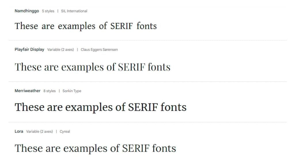
Serif fonts are typefaces with small decorative strokes—called serifs—at the end of larger strokes in letters. These fonts are often associated with tradition, reliability, and authority. They are commonly used in print media, such as books and newspapers, due to their legibility in long texts.
Popular Serif Fonts
- Times New Roman: Ubiquitous in book publishing and corporate communications.
- Garamond: Favored for its classic elegance and readability in print.
- Baskerville: Known for its academic and formal tone.
- Georgia: Designed for clarity on computer screens, it’s often used on websites.
- Palatino: Recognized for its readability and is a common choice for book text.
- Bodoni: Characterized by its sharp contrast in stroke weights and is popular in fashion.
Industries Best Suited by Serif Fonts
- Legal: Conveys professionalism, respectability, and traditional values.
- Publishing: Used for the readability of lengthy printed texts like books and newspapers.
- Academic Institutions: Associated with scholarly authority and history.
- Finance: Projects stability, reliability, and trustworthiness.
- Fine Arts and Culture: Reflects a classical aesthetic that aligns with historical art and literature.
Sans Serif Fonts
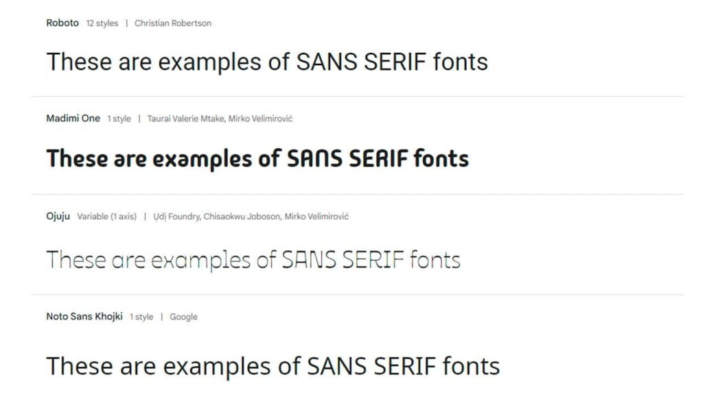
Sans serif fonts are typefaces that do not have the small projecting features called “serifs” at the end of strokes. They are often considered to have a modern, clean, and minimalist look. Sans serif fonts are typically used for their readability on digital screens and their sleek appearance in print design. They are versatile and widely used in various applications from body text to headlines.
Popular Sans Serif Fonts
- Helvetica: Used widely in branding, corporate identities, and signage.
- Arial: Commonly used as a default font in numerous applications.
- Verdana: Designed for high readability on computer screens.
- Roboto: Often seen in Android and Google services.
- Gotham: Has strong associations with professional and political branding.
- Futura: Known for its geometric shapes and commonly used in fashion and modern design.
- Calibri: Familiar from Microsoft Office Suite, typically used for business documents.
Industries Best Suited by Sans Serif Fonts
- Technology: For its modern and clean aesthetic that reflects innovation.
- Fashion and Lifestyle: Offers a chic and sophisticated vibe.
- Healthcare: Conveys cleanliness and efficiency.
- Marketing and Advertising: Versatile for both print and digital media’s legibility.
- Corporate Business: Helvetica, in particular, is synonymous with corporate branding.
- Automotive: Brands like BMW use sans serif fonts for a sleek, modern look.
Script Fonts
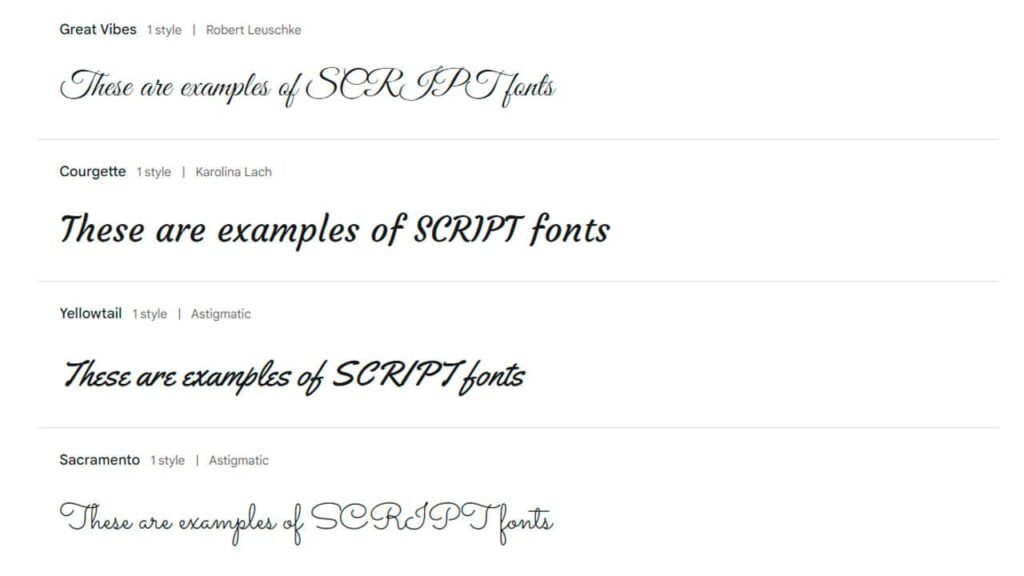
Script fonts mimic the fluidity of human handwriting and come in various styles, from elegant calligraphic designs to casual handwritten forms. These fonts often convey personality, creativity, and warmth. They are used to add a personal touch or artistic flair to design projects but are generally not suited for body text due to readability concerns.
Popular Script and Handwritten Fonts
- Brush Script: Mimics the look of handwriting with an ink brush, conveying a casual and approachable feel.
- Lobster: Known for its lovely bold script with variations, often used in invitations and headings.
- Pacifico: A fun, script font that captures the feel of vintage American advertising.
- Lucida Handwriting: It has a casual script look that mimics personal handwriting.
- Zapfino: Features elegant and intricate calligraphic strokes, suitable for formal invitations.
- Great Vibes: Offers a flowing, cursive style that’s perfect for formal occasions and branding.
Industries Best Suited by Script Fonts
- Wedding and Event Planning: Ideal for invitations and event branding, conveying elegance and exclusivity.
- Food and Beverage: Restaurants, cafes, and boutique food brands use script fonts to suggest authenticity or a handcrafted quality.
- Beauty and Fashion: Used in branding to convey a sense of sophistication and style.
- Creative Arts: Artists, photographers, and designers use script fonts to personalize their branding and promotional materials.
- Marketing and Advertising: To add a touch of personality or warmth in logos, slogans, and campaigns, especially for lifestyle brands.
Choosing the right font style can reinforce your brand’s message and ensure that your content is not just seen but felt in the way you intend.
Crafting Your Emotional Palette

Combining color and font psychology effectively requires understanding your brand’s core identity and the emotions you want to evoke in your audience. Here are steps to create an emotionally resonant web design:
- Identify Your Brand’s Emotional Core: What are the key emotions or values you want your brand to convey? Trust? Creativity? Innovation?
- Choose Colors Wisely: Select a primary color based on the emotion you wish to evoke most strongly, complemented by secondary colors that support your brand’s overall feel.
- Select Fonts That Reflect Your Brand’s Voice: Is your brand voice formal or casual? Innovative or traditional? Choose fonts that mirror these qualities.
- Test and Get Feedback: Colors and fonts can be perceived differently by different people. Test your choices with your target audience to ensure they evoke the intended response.
Wrapping Up
Carefully thought-out font choices, when harmoniously combined with a proper color palette, play a pivotal role in web design psychology by not only enhancing the aesthetic appeal and coherence of the site but also significantly improving the user’s experience. By meticulously selecting fonts that resonate with the businesses tone and coupling them with complementary colors, businesses can effectively convey their message, evoke desired emotions, and underscore their brand identity.
If you are looking to build an incredible website for your business, or have any questions or concerns regarding web design psychology, please don’t hesitate to reach out to me. I offer free design and marketing advice and am happy will help you make informed decisions about design & marketing for your business.
Thank you for reading.
